News — 09 August, 2017
Making HOT’s Design Experience Sizzle

Updates on our design strategy progress
Over the past few months, we’ve started a process to analyze and review HOT’s look and feel across our sites. This covers everything from content to our design assets like stylesheets and style guidelines. The process is just finishing its first phase and we wanted to provide an update on progress and share some initial directions.
Why do we need an update?
There are many pieces to our community’s OSM mapping workflow. From remote mapping to field mapping, to analysis and use, our community has a number of tools that we use on a consistent basis, and people’s ‘starting point’ with HOT could be across a variety of touchpoints. Back in late April, we shared that a number of tools were beginning new development phases and as a part of that process we wanted to ask ourselves, “how can we provide a better and more consistent user experience across all our tools?” By providing a consistent experience across the range of tools, we can help encourage newcomers as well as enable users to quickly and easily leverage all the tools across the workflow.
A key tool we wanted to consider during this process was how the main HOT website could be a better hub as a part of our mapping workflow. Entry points into the community, as well as connecting new and existing members is ever more critical as our community grows. Our community must make it easy to understand where and how to engage or get access to information.
Our process up to now
To start this process we identified a small working group of HOT volunteers and staff that have either been a part of the Community Working Group or have been involved in the design of our website in the past. This group has met on a weekly or bi-weekly schedule over the last few months.
We began the process by working with the design group Vizzuality to research and engage our community with a short perceptions survey. The research focused on assessing the range of tools, websites, and communication materials that make up our community. Their assessment fed directly into some initial prototypes for a visual direction -- looking at how HOT’s logo, typography, and colors fit together.
Using the research and analysis that Vizzuality has handed off, the Design Strategy Working Group has begun stepping through a number exercises to look at our website strategy and the details for how both the visual and functionalities meet our community’s needs. The group is looking at how to make HOT entry points more clear - how to new volunteers engage in working groups or understand where they can get started mapping immediately. We want to look at how we can better explain what we do to our project funders or interested partners who want to know more about how to use OpenStreetMap for their work. Ultimately we want to enable the HOT website to be a hub of information and feed users into the mapping workflow to further the mission of solving development challenges through OpenStreetMap.
Results and initial direction
Community Survey Results
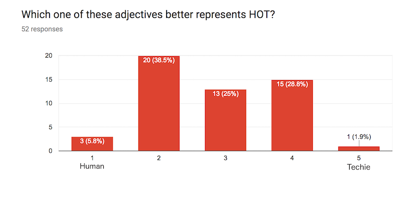
To start the research process, Vizzuality ran a simple three-question survey to gauge community perceptions. A total of 52 people responded to the survey. Over 40% of the respondents said that the HOT Community is better described by the word human instead of the word techie. In addition, over half of the ever more said that HOT was a place to volunteer and contribute, as opposed to a service that is critical for their job/work. The last question asked was about the significance of the logo and color. Respondents came back with keywords like emergency, urgency, and humanitarian.
Question 1 of the community survey: Which one of these adjectives better represents HOT?
Question 2 of the community survey: In my daily life, HOT is....

Question 3 of the community survey: What does the HOT logo and red color signify to you?

Brand Analysis
Using the results of the survey and their initial research, Vizzuality assembled an analysis slide deck that laid out some initial observations and perspectives. Access the document here.

HOT Hierarchy
During the analysis phase, we also took a look at how the various tools and projects fit together. In order to have a good design experience across all of these types of projects or collaborations, we need to have environment mapped out in order to understand how to apply new designs or experiences in the future. We developed a light structure for how HOT can think about branding and design across its projects. Some tools are core to HOT's workflow or projects; others are HOT-led but are collaborations with design and branding that isn't solely HOT; and lastly, HOT participates in collaborations that specific design and branding needs for those projects.

Initial visual ideas
Using the results from the research and analysis phase, one of the initial steps we wanted to take was to look at how visual styles can be harmonized across our core tools. Vizzuality came up with some initial ideas for what a new color palette could look like in order to feed into the rest of the visual style.

These are the initial ideas and if you have feedback on what is being proposed, please chime in on our Slack group or on Github.
Process going forward
Moving forward from here the working group is focused on several activities:
- Discussing user types and user task flows. A key part of our thinking about the future of hotosm.org is our community of users - volunteers, community and project leaders, journalists, NGOs, and funding organizations. We’re thinking through needs and coming up with interesting ideas for how to create a well-structured site.
- Technical review of our site. We want to keep our maintenance low but ensure we have a wide engagement and reach.
- Move into further building out design patterns and wireframing
- Take the new design patterns and wireframes and start with building out a new hotosm.org. From there, move to our core tools and incorporate the new styles and components.
Interested in participating or want to give some feedback? Join our dialog on Slack (#design-strategy room) or on Github. There are plenty of places to contribute and we welcome additional input. We’ll continue to post updates here and share the progress.