News — 04 September, 2018
Launching Visualize Change!
Today we’re launching Visualize Change, a new tool to see the change of OpenStreetMap over time. Anyone can automate the creation of embedded and downloadable animations for an area of interest to see the change in OSM. At FOSS4G last week, we showed it off and this week we’re sharing it to the wider OpenStreetMap community.
Visualizing OSM data is helpful for analyzing what and where data has changed. Visualize Change gives the HOT community the ability to assess an area or share with a partner about the work is happening. There are many tools out there to visualize snapshots of OSM data, compare two points in time, or watch OSM data be edited in real-time. There are even the incredible ITO World animations that have been periodically made — including one recent of Indonesia. Drawing inspiration from ITO World, Latest Changes tool (from Martin Raifer), and the malaria mapping visualization from MapBox, we wanted to take the first step at making it easier for anyone to create time-based animations to see progress or share what has changed within an area. Visualize Change is the result of that work.
Visualizing change across Open Cities Africa projects
We soft-launched the tool late this Spring and have been honing features and testing across the ten Open Cities Africa projects where we are supporting the World Bank. Check out two cities below:
Accra, Ghana
Daily change from July 1 to Sept 1 2018, access full visualization
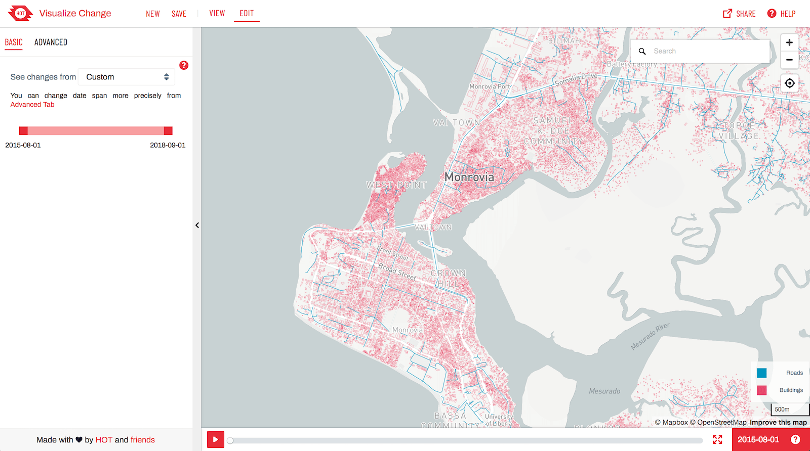
Monrovia, Liberia
Daily change from Sept 1 to Nov 1 2014, access full visualization
Make your own and share it on Twitter
Want to try it out? Create your own and share with us on Twitter.
There are two ways to get started visualizing an area: basic and advanced.
Basic
To get started with a basic visualization, you can quickly select the date range you’d like to see: last week, last month, or last year.

Advanced
To customize the dates you’d like to see or how you would like to visualize the changes, you can edit in advanced mode. You can customize the date range, interval, speed, background and colors.
Within each mode, you can save the view to then share it via a URL or create a downloadable video or gif.

Thanks to Flow/Control for helping build and support the development of the tool. Give it a spin and then share your results with #hotosm #visualizechange.